A Brand where Asia meets West.
Founders is a new retailer owned brand that aims to challenge the status-quo in the Philippines: a melting pot of cultures. A place with a rich visual culture that mixes Asian, European and American heritage.
The result is an original trademark inspired in the act of creation. “Founders” is based on those who take the first step, the pioneers exploring the world to discover new flavours, new ideas and new products. A true global brand that believes in open geographies.
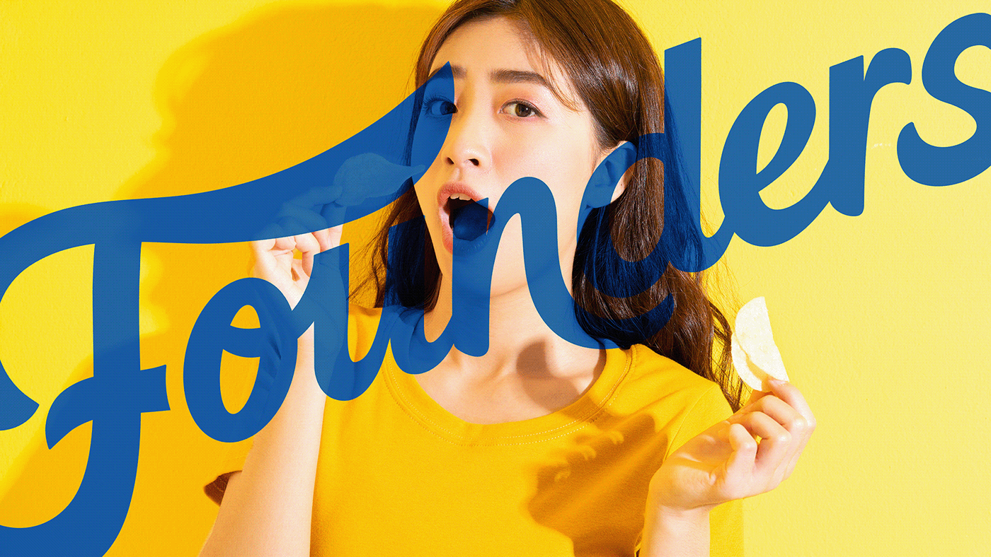
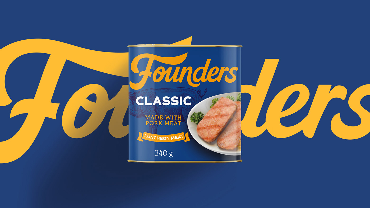
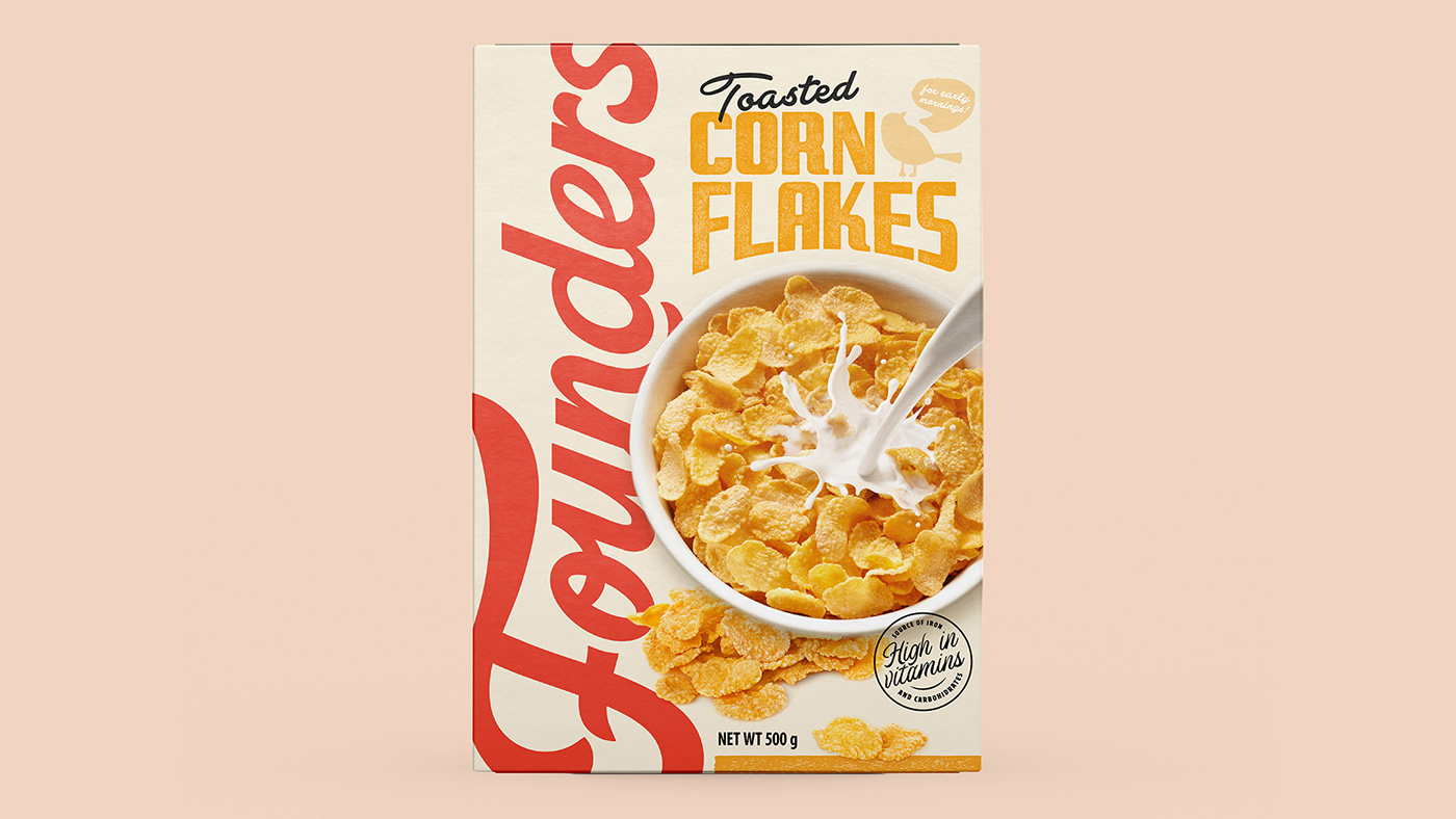
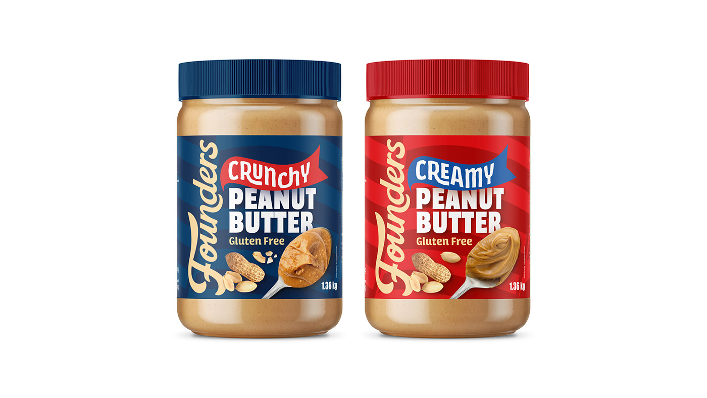
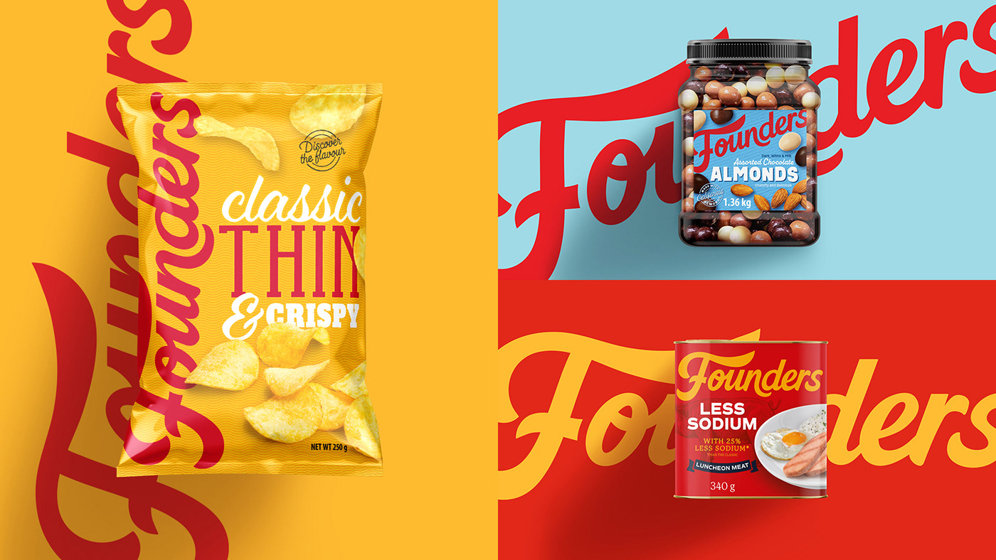
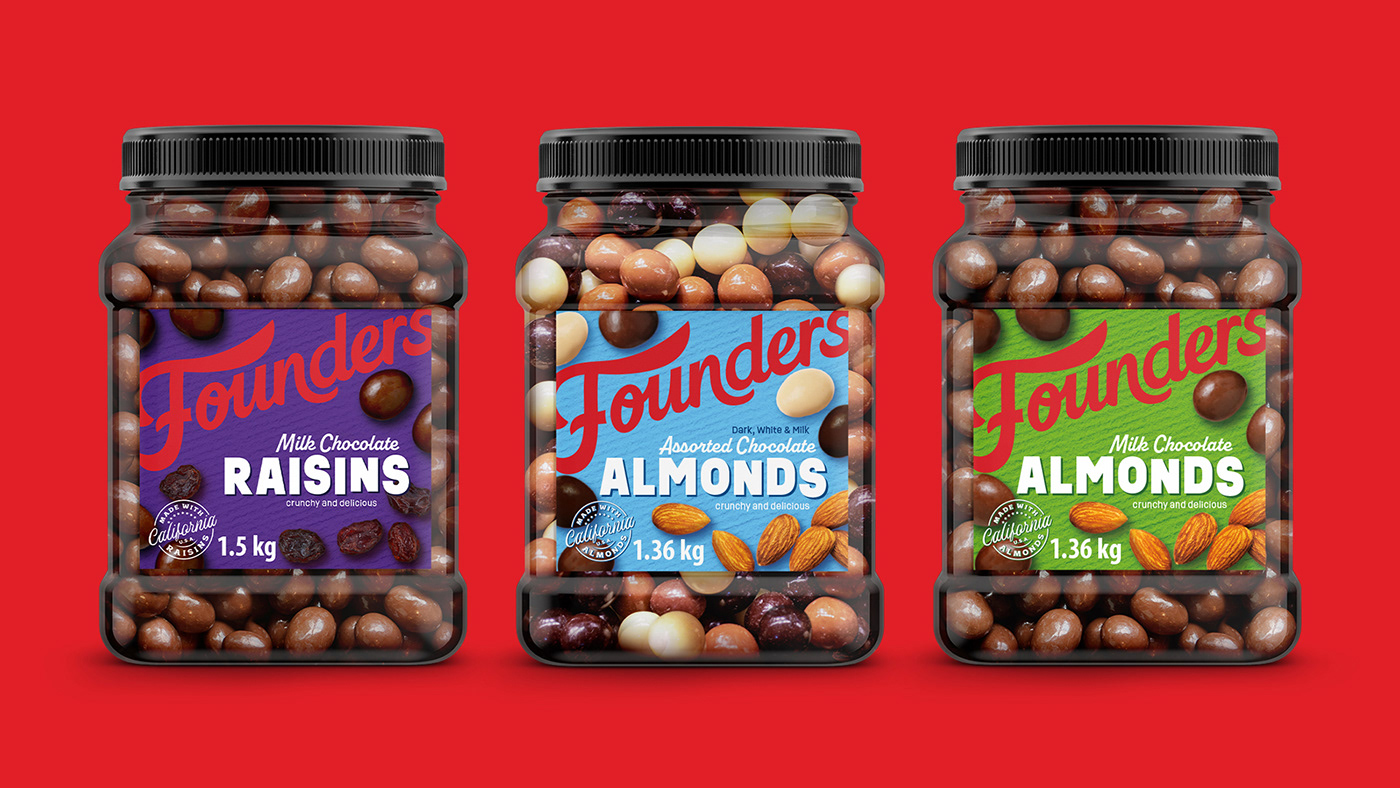
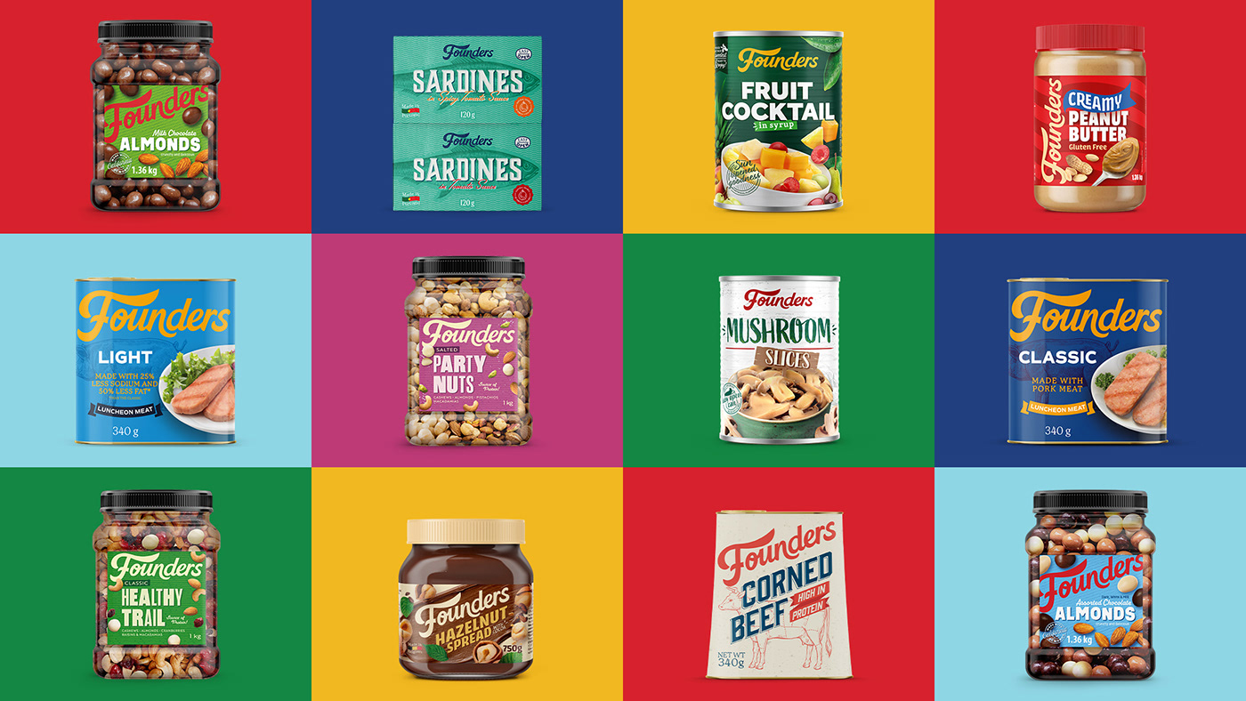
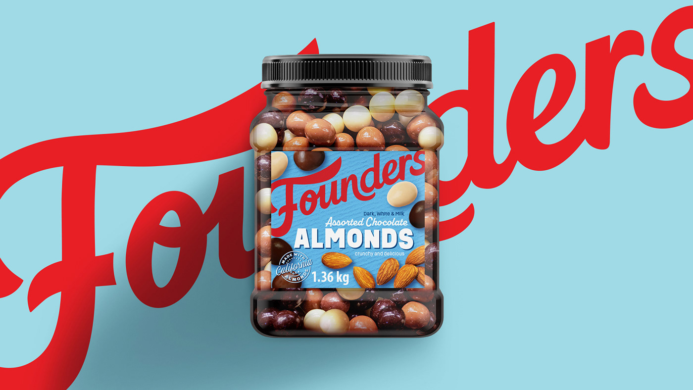
Founders’ visual identity has an obvious “americana” influence, inspired in typography signs and bold type compositions from the 60's. Delivering heritage inspired visuals, yet young, fresh, contemporary and bold, expressed in audacious color combinations and appealing photography.
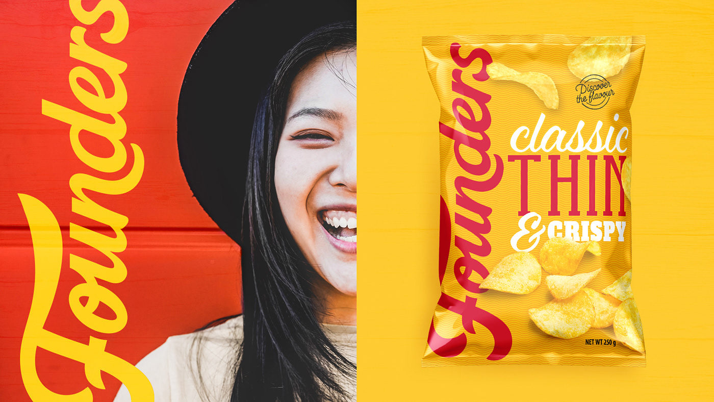
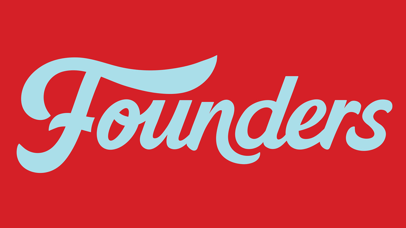
On pack the branding is clever and diverse. The brand logotype was born from the idea
of a personal signature, giving body to a unique identity, made by humans for humans. The logo takes different placements and sizes depending on the desired positioning, personality and product. It is the most important element to communicate. Its presence, size and shape are determined by the type of product and by a pre-determined matrix
of 4 possibilities. It embraces any desired colour to show elasticity and adaptability.